Personas
Me:
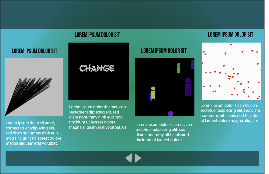
I myself am a persona embedded within my website as it is not merely a static representation but an essential part of my ongoing creative journey. Its purpose goes beyond maintaining a tab on my work; it's a constant companion in my quest for improvement and innovation. As I upload my projects and document my progress, I find a unique opportunity to critically evaluate each piece of work. By dissecting my projects and analyzing the choices I've made, I gain insights into what worked well and what didn't, enabling me to make informed decisions for future projects.
Moreover, this persona serves as a repository of my creative evolution. It's a fascinating chronicle of how my style has evolved over time. I can trace the subtle shifts in color palettes, design preferences, and even coding techniques. This retrospective view offers me a profound understanding of my artistic development, allowing me to adapt and refine my style as I progress. It's a reflective practice that keeps me grounded in my design roots while encouraging me to explore new horizons.
Beyond personal growth, this persona has a practical side too. It's a place where I can easily reference my past work, which proves invaluable when discussing projects with potential clients or collaborators. It becomes a powerful showcase of my capabilities, demonstrating not just my current skillset but the entire journey that has led me to this point.
In essence, this self-reflective persona is the heartbeat of my website. It's a testament to the dedication, curiosity, and passion that fuel my endeavors in web development and design technology. It encapsulates the essence of continuous improvement, personal growth, and the ever-evolving nature of creativity in the digital world.

Potential clients:
The persona of Kendal Porter, a potential client working at a startup, is a crucial element of my website's design. It's crafted to cater to the specific needs and expectations of individuals like her who are seeking web development and design services. Kendal's experience on my website is carefully curated to provide her with a comprehensive understanding of my skills, style, and versatility.
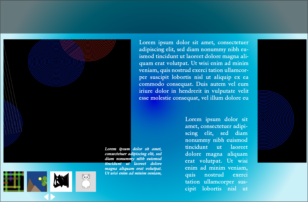
First and foremost, Kendal can view my work in intricate detail. Each project I've undertaken is presented with comprehensive descriptions, highlighting the design choices, technical aspects, and overall objectives. This detailed insight not only showcases my capabilities but also provides Kendal with a transparent view of how I approach projects. It helps her gauge whether my design philosophy aligns with her startup's vision and goals.
Furthermore, my website offers Kendal the chance to delve into my thought process. Through blog posts, case studies, and detailed project descriptions, she can gain insights into the creative thinking behind my work. This not only adds depth to the portfolio but also demonstrates my ability to communicate ideas effectively, a crucial aspect of any successful collaboration.
One of the key features catering to Kendal's needs is the ability to visually compare my diverse design styles and versatility. By presenting a variety of projects that span different industries, aesthetics, and functionalities, Kendal can see that I am adaptable and capable of tailoring my designs to suit the unique needs of her startup. This visual comparison assures her that I am not limited to a singular design style but can pivot and adapt as necessary, a quality highly valuable in the ever-changing landscape of web design.
In essence, Kendal's persona on my website is meticulously designed to address the concerns and curiosities of potential clients like her. It serves as a persuasive platform, not only showcasing my technical skills but also my ability to communicate and adapt, essential qualities for anyone seeking a web developer and design technologist to enhance their online presence.

Students seeking inspiration:
The persona of Dylan Ross, a student at NYU searching for inspiration for his personal website portfolio, adds a dynamic dimension to the purpose and functionality of my website. Dylan's experience on my website is geared towards providing him with a rich source of creative ideas and practical inspiration for his own design projects.
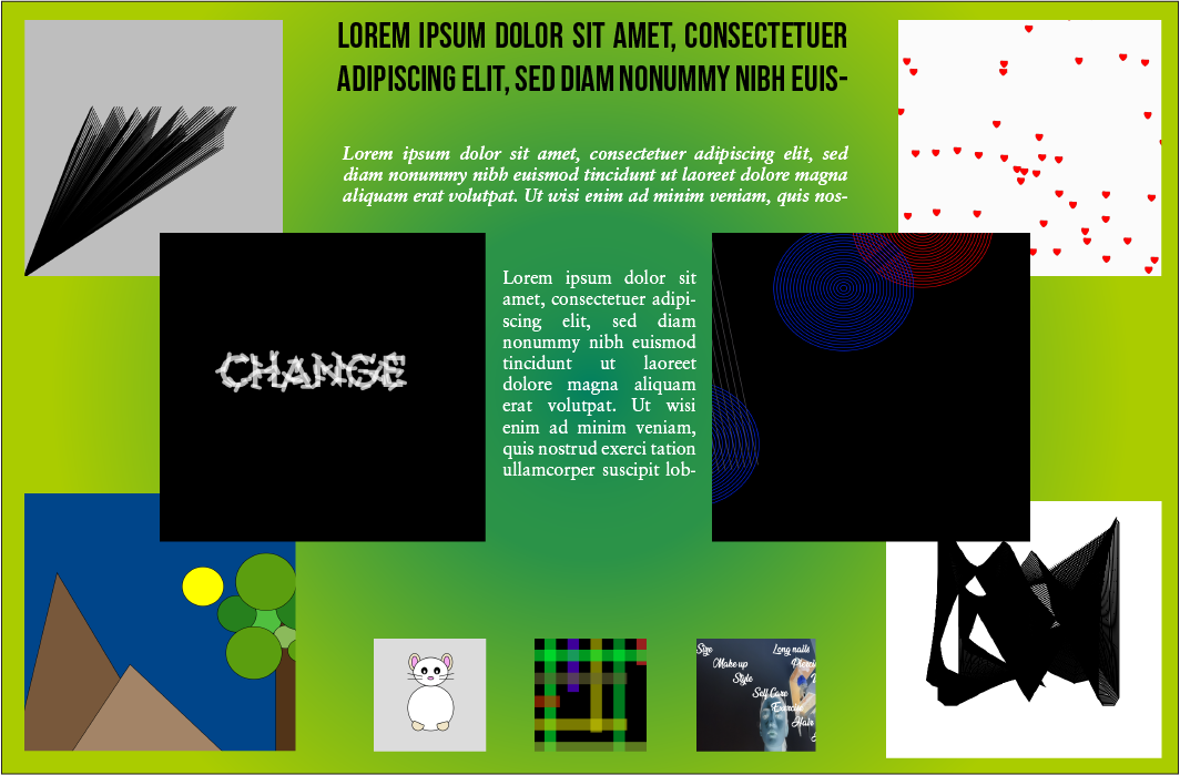
Firstly, my website serves as a comprehensive source of inspiration. Dylan can explore my diverse portfolio to get an overall idea of what's possible in web development and design. By browsing through a variety of projects, he can gain insights into different styles, layouts, and functionalities, helping him envision the possibilities for his own website.
Moreover, my website offers Dylan the opportunity to cherry-pick elements and ideas that resonate with him. He can identify specific design elements, typography choices, color schemes, or user interface features that he finds appealing and wishes to incorporate into his own portfolio. This process of selective inspiration empowers him to personalize his projects while drawing from the rich tapestry of concepts he encounters on my site.
For a student like Dylan who may be exploring different design directions, my website also encourages the creation of mood boards and the utilization of color palettes. He can gather and curate design elements that catch his eye, helping him visualize the aesthetics he wants to convey in his own work. The color schemes I've used in my projects can serve as a starting point, allowing him to experiment and see how different color combinations evoke specific moods and aesthetics.
In essence, Dylan's persona on my website is a testament to its role as a wellspring of creativity and innovation. It empowers aspiring designers like him with the tools and ideas needed to kickstart their own projects, fostering a culture of learning and growth within the design community. My website becomes not just a portfolio but a collaborative platform where design enthusiasts can explore, adapt, and create, inspired by the myriad possibilities it presents.
